See Synaptic in action
Here you'll find screenshots presenting the different
features of Synaptic. They show version 0.53 (GTK).
(Click on image to view larger version)
|
User Gallery
There is a gallery with screenshots of Synaptic users. If you like,
send us your Synaptic screenshot and comment! For more information
have a look at the user gallery.
|
|
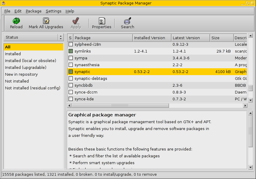
Main application window (GTK), version 0.53, showing the menu bar and the
main command buttons at the top. The main part shows the list of packages on
the right currently sorted by sections (left). The box below the package list
displays the description of the selected package.
[page top]
|
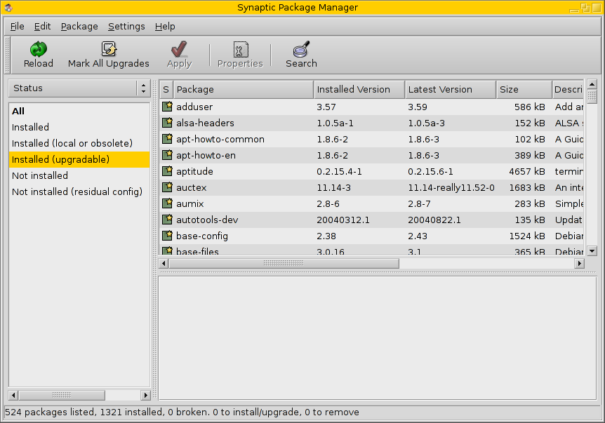
Again, the main window, but this time with the package list is sorted by status (left)
and shows only packages with upgrades available (right).
[page top]
|
|
|
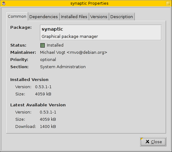
The properties dialog displays detailed information about a package. The different
tabs contain some common information (package name, maintainer, installed and available
version, ...), a list of dependencies, installed files for (installed) packages,
available versions and the package description.
[page top]
|
Using the filter editor you can modify standard or create custom filters.
A filter can check package status, user marks, section or versatile custom criteria.
[page top]
|

|
|
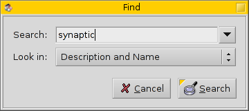
Synaptic features an easy-to-use search dialog. Searches can be done on names,
descriptions, maintainers, dependencies and so on.
[page top]
|
This is the main window again, showing an alternative layout. Instead of
the package description on the bottom, it shows the complete
package properties (as the dialog does).
[page top]
|

|
|
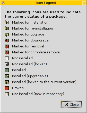
Synaptic uses a nice set of icons to show the package status. The use of icons
is consistent throughout the whole interface, so it is easy to see the status in
the differents lists and dialogs.
[page top]
|
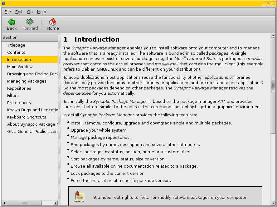
Synaptic comes with a detailed help document which explains the different
dialogs and features of the package manager.
[page top]
|
|
|

